


Dashboards are evolved plans
Dashboards are better than BCPs in several ways. In my last blog, I discussed why I believe dashboards will replace business continuity plans. Plan documents are an outdated format that no longer has value in today’s fast-paced business world. To help you better understand this idea, I will dig deeper into why dashboards are the new preferred medium.
In this post, I want to expand on the points I made to help you make a case for building dashboards instead of plans. Additionally, I advocate using a system to help you maximize the use of visuals and data. However, you do not need a complex tool to have an effective dashboard. You can create them in PowerPoint, Power BI, Excel, or other easily accessible layouts.

All-in-one
Many of you may see the phrase all-in-one and believe that I mean all-hazards plans. The all-hazard format is a standard in business continuity. The concept is a foundational element of continuity plans. It indicates that the plan does not have a specific hazard focus but versatile enough for any incident type. Unfortunately, this concept was difficult for customers to understand throughout my career as they expect a plan to list all the ways to deal with every hazard. Instead, it often felt that I offered them an overly complex plan that rarely answered their questions.
Beyond that, many plans follow the event lifecycle to document specific recovery strategies and procedures. Others formats are templates for particular businesses. A benefit of a visual view with essential data is that it enables flexibility for response and recovery to any event. Stay with me here; if you have done your job well to prepare your customers, they will understand how to best leverage the data provided for any crisis. As a result, they gain enhanced agility and preparedness to respond to incidents. Dashboards are better than BCPs because they give customers the real-time information they need for situational decision-making.

Personalized
As I mentioned previously, dashboards are customizable for your customers. The benefit is that it provides them with the information they need at times of disaster. Of course, as an expert, you will provide consulting and guidance to your business partners while listening to their input. Essential to successful preparedness is to develop tools that are tailor-made for the people using the information.
We have gotten away from this notion in many ways, often taking a cookie-cutter approach to planning and consulting. I get that it is easy and frequently requested that we provide a template. So, developing a dashboard for a customer is more challenging because it forces us to build something unique for customers. In the end, however, it is far better because this response tool has their needs in mind. Best of all, the dashboard provides quick, high-level views that can also share the underlining details for enhanced insight.
Deeper dive data
Being able to have easily digestible data is key to modern crisis response. Most events are fast-moving or have aspects that require quick decision-making. One of the failures I noted in crisis management in the past is the inability of many people to be confident in taking decisive action. For many years, I assumed that we had to be comfortable making split decisions with limited data. And although that remains true in some circumstances, I no longer believe it is entirely accurate.
Instead, dashboards are better than BCPs because they display real-time data to help us choose the best options with organizational needs in mind. Not only does it enable customers to understand their risks and provide situational awareness at a glance, it powerfully gives them the ability to drill down for greater insight when needed. This approach allows people to make higher-quality choices in a time of crisis. I cannot imagine that any of us would not want that for our customers.

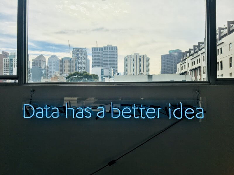
Visual view
As I alluded to, much of the information we receive is in pictures. For example, we look at social media that show us infographics, stories in pictures, and soundbites in quickly digestible formats. Likewise, we build process diagrams, charts, graphs, and word clouds with visual maps in the workplace. However, work environments vary by culture, and yours may require text with footnotes but many more leverage visual reports, presentations, and roadmaps.
I recommend dashboards over the plan with many pages because it aligns with the world around us. Most business continuity programs require extensive training or knowledge of jargon to understand. My experience is that this approach leaves the customer frustrated and completing the process only for compliance reasons. At its core, this concept is that we meet our customers where they are and develop a practice for crisis response aligned with its culture. For most of us, that is shifting to a visual medium. By making your format understandable and straightforward to the customer, you will provide them with increased resilience and efficiency in crisis response.

Available on the go
Finally, we need to be mindful that emergencies do not always happen when sitting at our desks. Disasters know no timeline or standard work hours. Those of you who have years of experience in the field know what I mean. All of us who have lived through COVID-19 over the past eighteen-plus months know this very well. Good leadership through these times has forced us to rethink many aspects of our existing programs.
Slowly, the world is opening up again for travel. Whether this means overseas business trips or resuming a commute to an office, flexibility in the workplace is the new norm. The next normal increases our risk in some ways and supports the notion that our resilience planning must incorporate increased mobility. Dashboards are better than BCPs because they are more easily read on smartphones, tablets, or laptops. Greater adaptability for our customers to get the information they need no matter where they are, in a format they can use also supports dashboards designed to be mobile accessible.

A customer focused future
At this point, I am guessing that you are wondering how I recommend conducting BCM without the traditional process of BIA, development of recovery strategies, plan development, exercising, and testing. The good news is that I am not advocating throwing out the best aspects of business continuity. Instead, I am advocating that we expand our thinking beyond the last forty years.
I praise and respect all of the practitioners that brought us to this point. But now, I suggest that we expand our programs to align with modern business practice. Operational resilience is also not new, but it is an evolving roadmap for our future. We need to take business continuity to the next level or be left behind. In my next post, I will expand on why I think a customer-centric, service-focused model will be the new best practice approach.